Product
sections/main-product.liquid · section type main-product
Used on templates: product.brand-story, product.gift-card, product, product.modal, product.preorder, product.product-landing
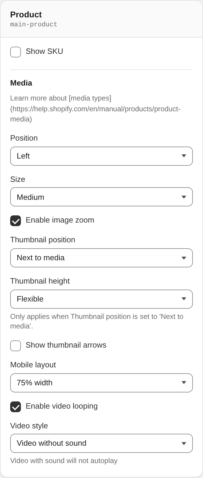
Section settings
| Setting | ID | Type | Default | Notes |
|---|---|---|---|---|
| Show SKU | sku_enable | checkbox | — | — |
Media
Learn more about media types
| Setting | ID | Type | Default | Notes |
|---|---|---|---|---|
| Position | image_position | select | left | Options: Left · Right |
| Size | image_size | select | medium | Options: Small · Medium · Large |
| Enable image zoom | product_zoom_enable | checkbox | true | — |
| Thumbnail position | thumbnail_position | select | beside | Options: Next to media · Below media |
| Thumbnail height | thumbnail_height | select | flexible | Only applies when Thumbnail position is set to 'Next to media'.<br>Options: Fixed · Flexible |
| Show thumbnail arrows | thumbnail_arrows | checkbox | — | — |
| Mobile layout | mobile_layout | select | partial | Options: 75% width · Full width |
| Enable video looping | enable_video_looping | checkbox | true | — |
| Video style | product_video_style | select | muted | Video with sound will not autoplay<br>Options: Video without sound · Video with sound |
Blocks
App blocks
Block type @app
App block. Its settings are provided by the app the merchant installs.
Price
Block type price
No settings.
Quantity selector
Block type quantity_selector
No settings.
Complementary products
Block type complementary_products
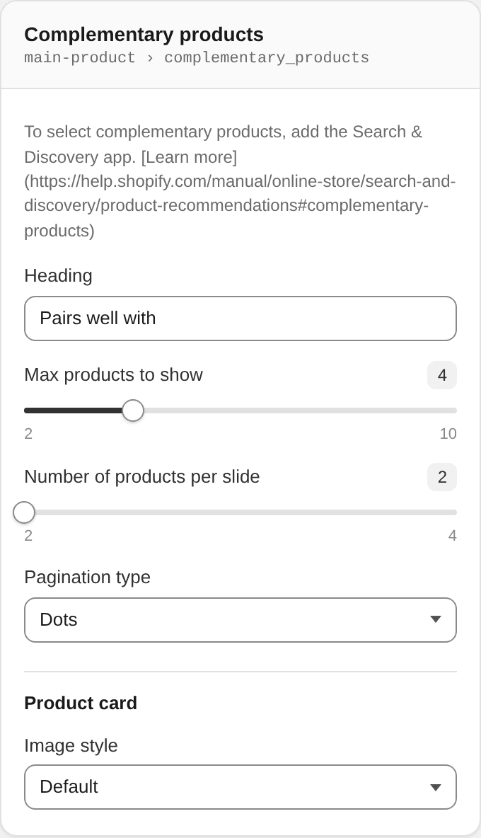
To select complementary products, add the Search & Discovery app. Learn more
| Setting | ID | Type | Default | Notes |
|---|---|---|---|---|
| Heading | product_complementary_heading | text | Pairs well with | — |
| Max products to show | complementary_count | range | 4 | Range 2–10, step 1 |
| Number of products per slide | per_slide | range | 2 | Range 2–4, step 1 |
| Pagination type | control_type | select | dots | Options: Dots · Arrows |
Product card
| Setting | ID | Type | Default | Notes |
|---|---|---|---|---|
| Image style | image_style | select | default | Options: Default · Circle |
Size chart
Block type size_chart · limit 1
Theme Editor block panel (metafield priority, Size chart page, Hide size chart collections):
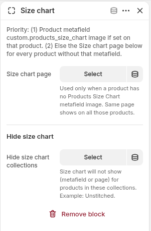
Default placement in templates/product.json: after Quantity selector.
Opens a clean white modal (app-style) with a close control. Content and visibility follow the rules below.
Priority & visibility
| Order | Source | When it applies |
|---|---|---|
| 1 | Product metafield Products Size Chart (custom.products_size_chart, type File / Image) | Product has an image in that metafield |
| 2 | Size chart page (block setting) | Product has no metafield image — same page for every such product |
| — | Hidden entirely | Product belongs to any collection listed under Hide size chart collections (overrides 1 and 2) |
If neither metafield image nor page is available, the Size chart link is not rendered.
Modal / zoom UX
- Metafield image: full-width in a white panel; optional SKU (or product title) heading; light +/−/reset zoom controls; pinch, double-tap, and Ctrl/⌘ + scroll also zoom.
- Fallback page: page title + rich page content (
rte), including embedded images/tables. - Mobile and desktop: modal width ~94vw / up to ~640px; image scales to full content width.
Theme Editor settings
| Setting | ID | Type | Default | Notes |
|---|---|---|---|---|
| (help text) | — | paragraph | — | Explains metafield → page priority |
| Size chart page | size_chart | page | — | Fallback when product has no custom.products_size_chart image. Same page for all products without the metafield. |
| Hide size chart collections | hide_size_chart_collections | collection_list | — | Multi-select (up to 50). Size chart is not shown for products in these collections (e.g. Unstitched). Metafield image and page fallback both skipped. |
Merchants setup
- Shopify Admin → Settings → Custom data → Products — create metafield
- Name: Products Size Chart
- Namespace and key:
custom.products_size_chart - Type: File (images)
- On each product that needs a custom chart, upload the image into that metafield.
- Theme Editor → Product page → Size chart block:
- Select a default Size chart page for products without a metafield.
- Under Hide size chart, multi-select collections that should never show size chart (e.g. Unstitched).
- Keep the block after Quantity selector (default) so the link appears in the form stack.
Related files
snippets/product-size-chart-content.liquid
snippets/product-template.liquid
snippets/variant-button.liquid
snippets/tool-tip-trigger.liquid
assets/theme.js          (size-chart-zoom custom element)
assets/theme.css.liquid  (modal + zoom styles)
sections/main-product.liquid  (block schema)
Variant picker
Block type variant_picker
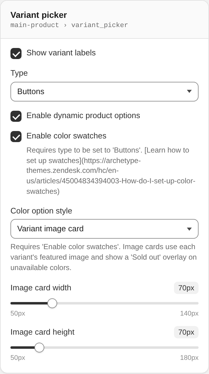
| Setting | ID | Type | Default | Notes |
|---|---|---|---|---|
| Show variant labels | variant_labels | checkbox | true | — |
| Type | picker_type | select | button | Options: Buttons · Dropdown |
| Enable dynamic product options | product_dynamic_variants_enable | checkbox | true | — |
| Enable color swatches | color_swatches | checkbox | true | Requires type to be set to 'Buttons'. Learn how to set up swatches |
| Color option style | color_display_style | select | image | Requires 'Enable color swatches'. Image cards use each variant's featured image and show a 'Sold out' overlay on unavailable colors.<br>Options: Color swatch · Variant image card |
| Image card width | image_card_width | range | 70 | Range 50–140 px, step 2<br>Shown when color_display_style == 'image' |
| Image card height | image_card_height | range | 70 | Range 50–180 px, step 2<br>Shown when color_display_style == 'image' |
Mobile: Variant image colour cards (.variant-input-wrap--image) are centered on viewports ≤768px so colour options align with other centered PDP text on mobile.
Description
Block type description
| Setting | ID | Type | Default | Notes |
|---|---|---|---|---|
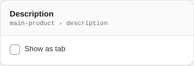
| Show as tab | is_tab | checkbox | — | — |
| Display style | display_style | select | collapsible | Options: Tabs (Details | Description) · Collapsible button. Collapsible shows a full width button with a 1px solid black border (like Add to cart), with Details and Description inside it. Default is Collapsible button. |
| Collapsible button text | collapsible_label | text | Details & Description | Shown when display_style == 'collapsible' |
| Open by default | collapsible_open | checkbox | false | Shown when display_style == 'collapsible' |
Drag the Description block below Buy buttons in the Theme Editor to place the collapsible under Add to cart and Buy it now.
Related Products
Block type related_products
Shows products chosen in the product metafield custom.related_products (type List of products). Layout matches Product recommendations on desktop and mobile (same grid/carousel controls). Place this block after Description.
| Setting | ID | Type | Default | Notes |
|---|---|---|---|---|
| Heading | heading | text | Related Products | — |
| Items to show | products_to_show | range | 50 | Range 2–50. In Sizes mode each color + size is one card. |
| Products per row | per_row | range | 4 | Range 2–5 (desktop) |
| Products per row (mobile) | per_row_mobile | range | 2 | Range 1–4 |
| Show related items as | display_mode | select | colors | Options: Products · Colors · Sizes (color + size). Default is Colors. |
| Colors mode button | colors_action | select | color_name | Visible when display mode is Colors. Options: Color name · Size dropdown. Default is Color name. |
| Card button text | button_label | text | Quick View | Shown only when display mode is Products. Colors mode can use the color name. Sizes mode uses color + size (variant title). |
| Button height | button_height | range | 32 | Range 24–56 px |
| Button font size | button_font_size | range | 12 | Range 10–18 px |
| Button font weight | button_font_weight | select | 700 | Regular · Medium · Semi bold · Bold · Extra bold |
| Button text case | button_text_transform | select | uppercase | As typed · Uppercase · Capitalize · Lowercase |
Setup: Shopify Admin → Settings → Custom data → Products → metafield List of products at custom.related_products. Then edit a product and select related products in that metafield.
Buy buttons
Block type buy_buttons
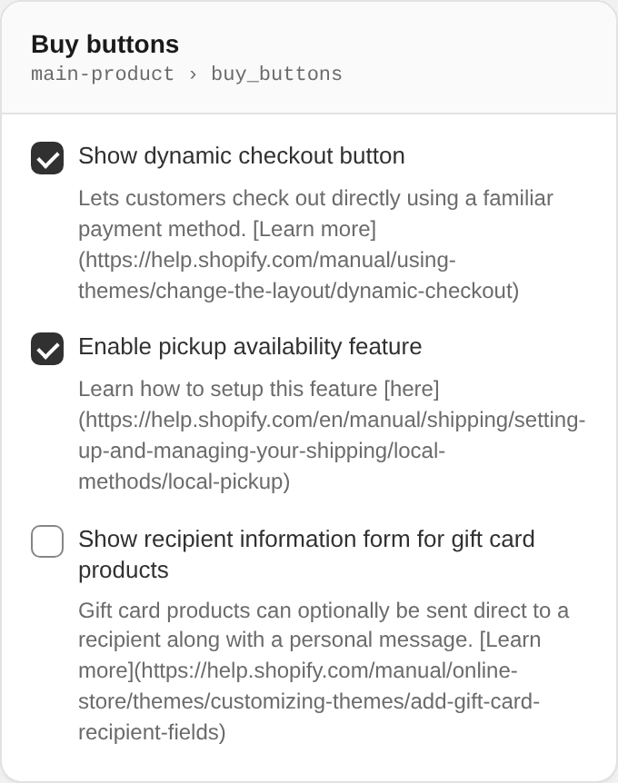
| Setting | ID | Type | Default | Notes |
|---|---|---|---|---|
| Show dynamic checkout button | show_dynamic_checkout | checkbox | true | Lets customers check out directly using a familiar payment method. Learn more |
| Enable pickup availability feature | surface_pickup_enable | checkbox | true | Learn how to setup this feature here |
| Show recipient information form for gift card products | show_gift_card_recipient | checkbox | false | Gift card products can optionally be sent direct to a recipient along with a personal message. Learn more |
Inventory status
Block type inventory_status
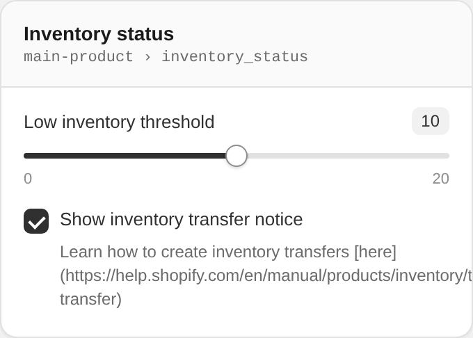
| Setting | ID | Type | Default | Notes |
|---|---|---|---|---|
| Low inventory threshold | inventory_threshold | range | 10 | Range 0–20, step 2 |
| Show inventory transfer notice | inventory_transfers_enable | checkbox | true | Learn how to create inventory transfers here |
Sales point
Block type sales_point
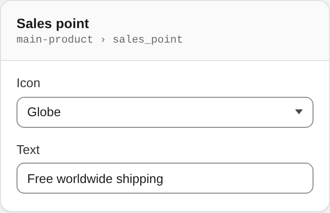
| Setting | ID | Type | Default | Notes |
|---|---|---|---|---|
| Icon | icon | select | globe | Options: Checkmark · Gift · Globe · Heart · Leaf · Lock · Package · Phone · Ribbon · Shield · Tag · Truck |
| Text | text | text | Free worldwide shipping | — |
Text
Block type text
| Setting | ID | Type | Default | Notes |
|---|---|---|---|---|
| Text | text | text | Text block | — |
Trust badge
Block type trust_badge
| Setting | ID | Type | Default | Notes |
|---|---|---|---|---|
| Image | trust_image | image_picker | — | — |
Tab
Block type tab
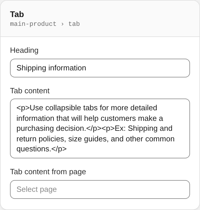
| Setting | ID | Type | Default | Notes |
|---|---|---|---|---|
| Heading | title | text | Shipping information | — |
| Tab content | content | richtext | <p>Use collapsible tabs for more detailed information that will help customers make a purchasing decision.</p><p>Ex: Shipping and return policies, size guides, and other common questions.</p> | — |
| Tab content from page | page | page | — | — |
Share on social
Block type share
Choose which platforms to share to in global theme settings
Separator
Block type separator
No settings.
Contact form
Block type contact
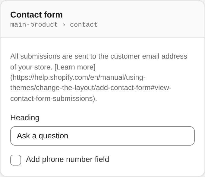
All submissions are sent to the customer email address of your store. Learn more.
| Setting | ID | Type | Default | Notes |
|---|---|---|---|---|
| Heading | title | text | Ask a question | — |
| Add phone number field | phone | checkbox | — | — |
Countdown timer
Block type countdown_timer
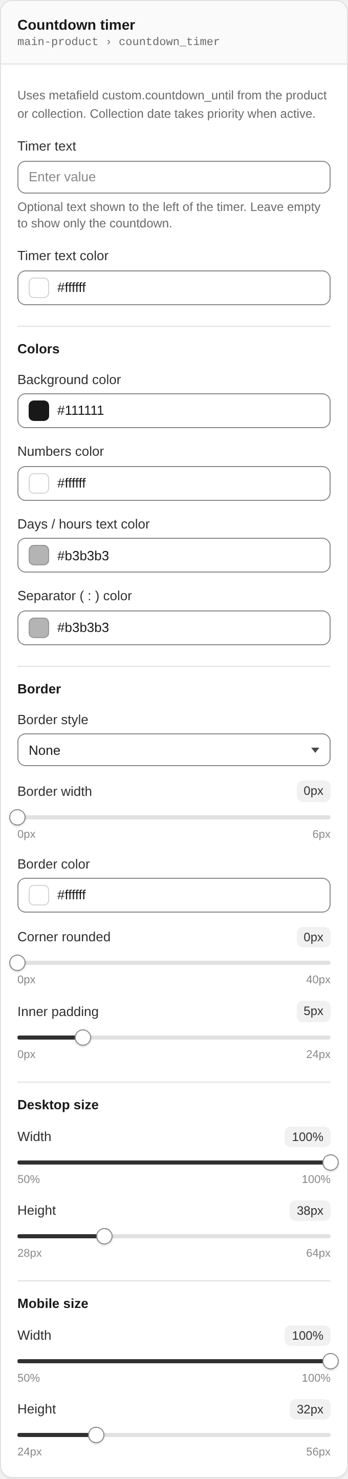
Uses metafield custom.countdown_until from the product or collection. Collection date takes priority when active.
| Setting | ID | Type | Default | Notes |
|---|---|---|---|---|
| Timer text | countdown_timer_text | text | — | Optional text shown to the left of the timer. Leave empty to show only the countdown. |
| Timer text color | countdown_timer_text_color | color | #ffffff | — |
Colors
| Setting | ID | Type | Default | Notes |
|---|---|---|---|---|
| Background color | countdown_bg_color | color | #111111 | — |
| Numbers color | countdown_numbers_color | color | #ffffff | — |
| Days / hours text color | countdown_labels_color | color | #b3b3b3 | — |
| Separator ( : ) color | countdown_separator_color | color | #b3b3b3 | — |
Border
| Setting | ID | Type | Default | Notes |
|---|---|---|---|---|
| Border style | countdown_border_style | select | none | Options: None · Solid · Dotted · Dashed · Double |
| Border width | countdown_border_width | range | 0 | Range 0–6 px, step 1 |
| Border color | countdown_border_color | color | #ffffff | — |
| Corner rounded | countdown_border_radius | range | 0 | Range 0–40 px, step 1 |
| Inner padding | countdown_padding | range | 5 | Range 0–24 px, step 1 |
Desktop size
| Setting | ID | Type | Default | Notes |
|---|---|---|---|---|
| Width | countdown_width | range | 100 | Range 50–100 %, step 1 |
| Height | countdown_height | range | 38 | Range 28–64 px, step 1 |
Mobile size
| Setting | ID | Type | Default | Notes |
|---|---|---|---|---|
| Width | countdown_mobile_width | range | 100 | Range 50–100 %, step 1 |
| Height | countdown_mobile_height | range | 32 | Range 24–56 px, step 1 |
HTML
Block type custom
| Setting | ID | Type | Default | Notes |
|---|---|---|---|---|
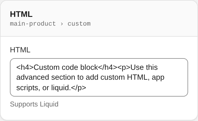
| HTML | code | liquid | <h4>Custom code block</h4><p>Use this advanced section to add custom HTML, app scripts, or liquid.</p> | Supports Liquid |