Text columns with icons
sections/text-with-icons.liquid · section type text-with-icons
Used on templates: index, page.careers
Presets: Text columns with icons
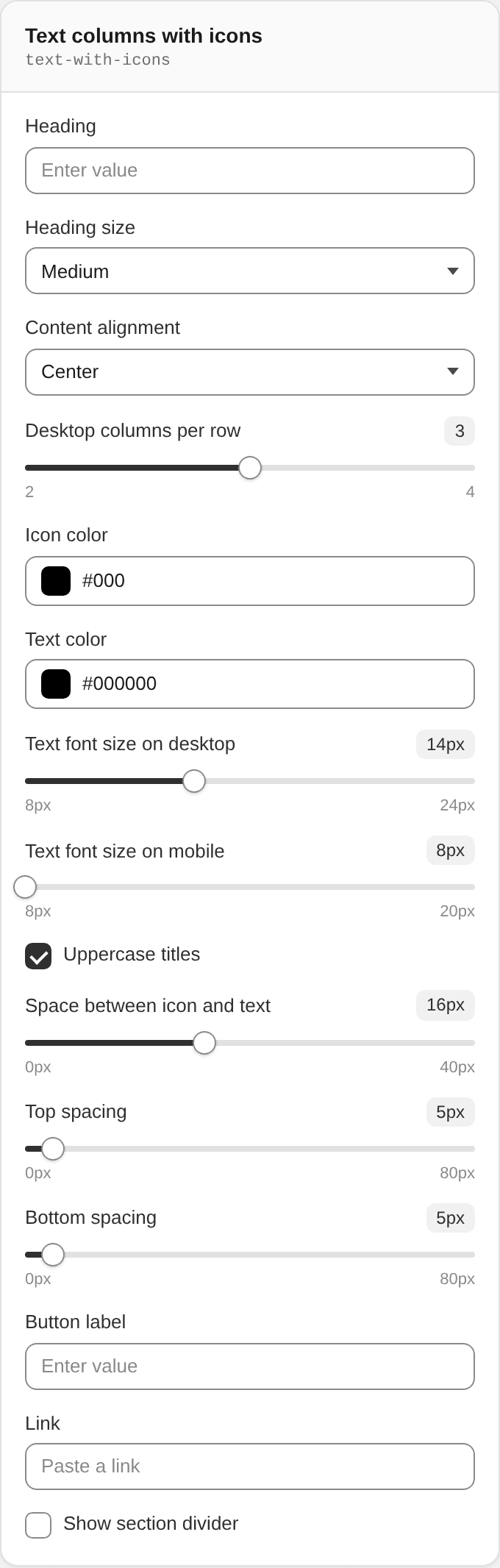
Section settings
| Setting | ID | Type | Default | Notes |
|---|---|---|---|---|
| Heading | title | text | — | — |
| Heading size | heading_size | select | h2 | Options: Small · Medium · Large |
| Content alignment | align_text | select | center | Options: Left · Center |
| Desktop columns per row | desktop_columns_per_row | range | 3 | Range 2–4, step 1 |
| Icon color | icon_color | color | #000 | — |
| Text color | text_color | color | #000000 | — |
| Text font size on desktop | text_font_size | range | 14 | Range 8–24 px, step 1 |
| Text font size on mobile | text_font_size_mobile | range | 8 | Range 8–20 px, step 1 |
| Uppercase titles | uppercase_titles | checkbox | true | — |
| Space between icon and text | icon_text_gap | range | 16 | Range 0–40 px, step 2 |
| Top spacing | spacing_top | range | 5 | Range 0–80 px, step 1 |
| Bottom spacing | spacing_bottom | range | 5 | Range 0–80 px, step 1 |
| Button label | button_label | text | — | — |
| Link | button_link | url | — | — |
| Show section divider | divider | checkbox | false | — |
Blocks
Column
Block type text_block
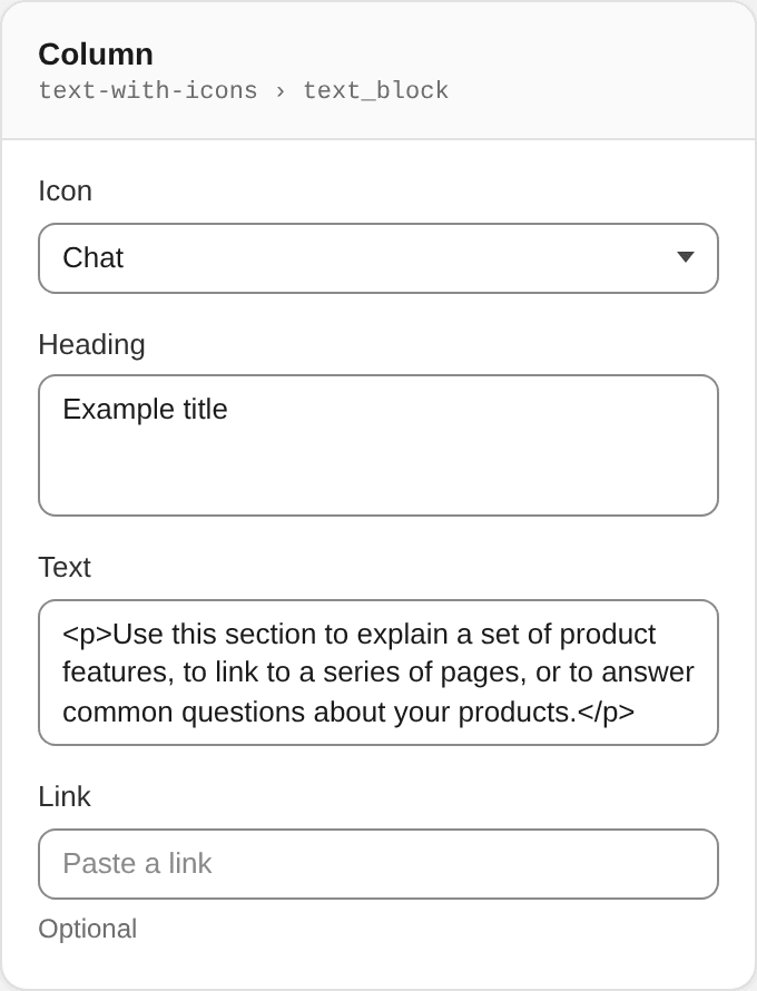
| Setting | ID | Type | Default | Notes |
|---|---|---|---|---|
| Icon | icon | select | chat | Options: Bills · Cart · Credit cards · Sales tag · Store · Wallet · Location · Package · Return · Truck · Chat · Envelope · Phone · Heart · Ribbon · Shield · Thumbs up · Trophy · Cotton · Plant · Recycle · Sun · Hanger · Shirt · Sparkle · Calendar · Charity · Gears · Gift · Globe · Lightning bolt · Stopwatch |
| Heading | title | textarea | Example title | — |
| Text | text | richtext | <p>Use this section to explain a set of product features, to link to a series of pages, or to answer common questions about your products.</p> | — |
| Link | link | url | — | Optional |