Mobile Layout
Version: 2.1.2
Viewport: Narrow screens (below the lg breakpoint). Same routes as desktop; sidebar becomes a drawer.
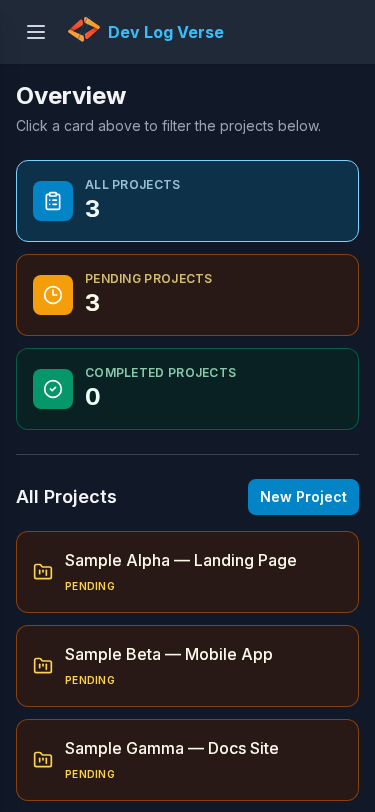
Overview (closed menu)
Steps
- Open the app on a phone-sized screen (or shrink the browser).
- You see the top bar with Open menu (hamburger) and the page title.
- Main content is Overview filters and the project list (same as Overview).
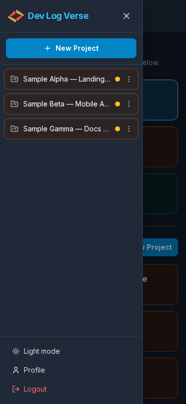
Open the menu drawer
Steps
- Tap Open menu.
- The sidebar slides in (brand, New Project, projects, theme, Profile, Logout).
- A dimmed backdrop appears behind the drawer.
- Tap Close menu, the backdrop, or a navigation link to dismiss.
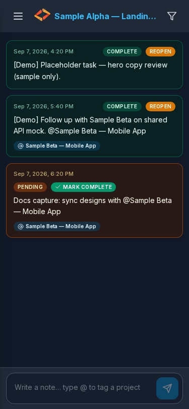
Project chat on mobile
Steps
- From Overview or the drawer, open a project.
- Timeline and composer stack vertically; use Open menu anytime for sidebar actions.
- Writing notes,
@mentions, filters, and Mark Complete work the same as on desktop — see Project Chat and related guides.
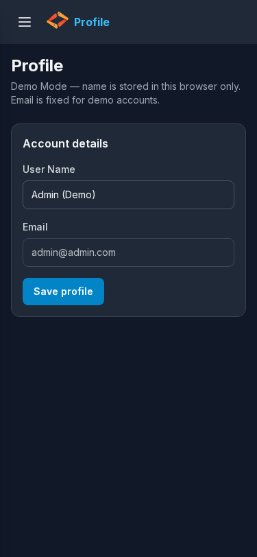
Profile on mobile
Steps
- Open the menu → tap Profile.
- Edit name / password using the same fields as Profile.
Tips
- Prefer portrait width ~375px when checking docs screenshots.
- Desktop guides still apply; only chrome (menu vs persistent sidebar) changes.